Showing posts with label Dell Comics. Show all posts

Thursday, September 11, 2025

Dinky and Donald Duck: "Separated at Mirth" and United by Other Factors!

One of the things I love most about indexing comic books for the GRAND COMIC DATABASE (GCD) is the optional assignation of "Unofficial Titles" to untitled stories and covers.  My unofficial title for the cover of  DINKY DUCK #8 (St. John Comics, Cover Date: February, 1954) is... (wait for it...)

"Schematic for a Good Ski-Medic"

There's a title even *I'm* impressed by :-)  I also LOVE this cover!  Perfectly capturing the characters of obnoxious egotist Rudy Rooster, and his overly-loyal and faithful pup Dinky Duck. 

A similar Carl Barks cover had HD&L "standing-by" with a med-kit as Donald was about to ski, but Dinky actually going down the mountain AFTER Rudy, shows his (oft-misplaced) concern AND much better carries the gag!  

Of course, it could (...and probably SHOULD) be said that, as good Junior Woodchucks, you'd expect the Duck boys to take the more sensible approach!    

WALT DISNEY'S COMICS AND STORIES #149 (Dell Comics, Cover Date: February, 1953) - one year earlier! 

Whichever one you prefer, I think it's safe to say that it's "snow fun" being Donald or Rudy when they carelessly demonstrate "tropes on the slopes"

Thursday, August 21, 2025

Adventures in Comic-Boxing: How Bambi SHOULD Have Turned Out!

 (Sigh!)  If only Bambi and his mother were jungle denizens, rather than of the forest variety! 

...Love the cover anyway!  

From TARZAN #127 (Dell Comics, Cover Date: November-December, 1961) - Painted Cover by the great George Wilson. 

Wednesday, July 2, 2025

I’m Not an Artist (...or Colorist), But… WHAT Massive Fist?!

I am not an artist, nor am I a colorist.  If I WERE a colorist, I would be a worse colorist than I would be as an artist.  

It's not just a matter of specific skills of art and coloring that I have never possessed, it's also my admitted lack of creative imagination in those two areas!  

Oh, I have an almost limitless creative imagination in the area of WRITING!  This Blog, my many APA and fanzine writings of yore, and my professional comics work bear testament to that.  But, even if I had sufficient skills in the areas of art and coloring, my work would at best rank as pedestrian, as I have scant (all together now) creative imagination to apply to said work. 

Art is, of course, a matter of subjective taste.  Meaning that while I (and, presumably, most of you) really like things like THIS...


 ...Or THIS...


 ...Or THIS...


...I do allow for the possibility, remote as it may be, that there COULD BE some folks who actually like THIS...

...Even if it's only the artist himself, and possibly his editor!  

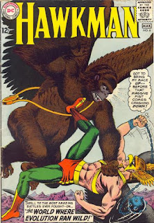
But, when COLORING fails, it's pretty much universal!  For instance, take the cover of HAWKMAN #6 (DC Comics, Cover Date: February-March, 1965) and its titanic struggle between Hawkman and a great winged-gorilla. 


Hawkman says: "Got to bring my mace UP -- before that massive fist comes crashing DOWN!" 

MASSIVE FIST?!  WHAT MASSIVE FIST?!  Without squint-staring really hard, do you see any massive fist?  

Quick aside: It has nothing to do with the quality of the digital image used above.  I have the actual comic here beside me as I write this, and the "real thing" looks exactly the same!  


It would seem to be a matter of too much dark brown concentrated in what should be a critical area of the illustration!  

Let's assume there was insufficient room for artist [The Great] Murphy Anderson to position the gorilla's arm and fist elsewhere on the cover, as the dramatic focus of the piece is the gorilla about to smash Hawkman into a fine Hawk-puree! (Sorry, but my keyboard doesn't allow for the accent mark, and spell-checker isn't offering it either!) 

But, perhaps just the slightest bit of gradation in the dark brown might have made a difference, or maybe a better-defined outline of the gorilla's arm and fist to separate it in depth relative to the  gorilla's wing! 

Then again, the coloring techniques of the Silver Age were far more limited than they would be beginning in the 1980s, so I don't have a definitive solution to offer.  

But, that's why I’m Not an Artist (...or Colorist), But… I'm still left to ask "Massive fist? WHAT massive fist?!"


Oh, and for a "massive fist" that you actually CAN see clearly, try this on for massive-size!  

Oh, THAT massive fist! Got it!  
No, actually Superman got it... right in the super-breadbasket! 

Wednesday, June 25, 2025

There's Just Something About a Pink Bow...

A universal shorthand technique in creating a female counterpart to a male character - in animation and in comics - is to give that counterpart a HAIR BOW... usually pink!  

But, how would that play out in real life?  Well, Cici's here to show you!  

...And doesn't she look CUTE?  With or without the bow!  

Thursday, March 13, 2025

Adventures in Comic-Boxing: Somebody Stole Donald's Gag!

When the great editor Julius Schwartz was in charge of certain Silver Age DC Comics titles, he used to say (...and I'm paraphrasing as best I can) that the story should, in some way, highlight - or otherwise showcase - the particular hero's individual powers.  

The Flash's powers are "showcased" in... SHOWCASE!  

Meaning that a FLASH story should be geared toward velocity, a GREEN LANTERN story should feature "power ring" stunts, and an ATOM story should involve its star becoming very small!  

Otherwise, you just have a generic story that could be told for any old generic hero.  

I'm reminded of that when I read the Inside Back Cover Gag from ADVENTURES OF MIGHTY MOUSE #151 (Dell Comics, Cover Date: July-September, 1961) titled "The Free Book", with art by Dan Gormley...

More than simply not catering to Mighty Mouse's powers - or his very existence as a super powered mouse - this gag doesn't even need to star a superhero!  

We'll enlarge it below for your reading pleasure... 
In fact, this gag would seem to be best suited to DONALD DUCK, what with his impatient nature and trademark slow burn, and would have made a dandy one-page gag for a Dell or Gold Key comic, or an Al Taliaferro Donald Sunday newspaper strip.  

This cover, which I'd like much more if Carl Barks or Tony Strobl had drawn it, will give you an idea of what I mean! 

You could even pare it down to four panels and make it a weekday strip.  


But instead it is MIGHTY MOUSE who usurps Donald's gag.  And, hey... It's not like, in return,  Donald could... you know, like become a superhero and "Save the Day"... 

...Aw, skip it!  

Friday, February 21, 2025

Separated at Mirth: Pick Your Poison(ed Water)!

If faced with a choice of soapy bath water as in POPEYE #50 (Dell Comics, Cover Date: October-December, 1959), or soapy wash water as in YOSEMITE SAM #27 (Gold Key Comics, Cover Date: April, 1975), what would YOU do to keep from dying of thirst?   


The oddball thing about poor Sam's predicament is that Bugs Bunny DOESN'T WEAR ANY CLOTHES, so what is he washing?  

Thursday, January 30, 2025

Adventures in Comic-Boxing: The Case of the Migrating Penguin!

When it comes to PENGUINS, Warner Bros. Looney Tunes has a pretty memorable one that twice co-starred with Bugs Bunny...

Walter Lantz had a pretty memorable one of his own... CHILLY WILLY! 

But there must have been a brief period during Chilly's tenure at Lantz when he may have become dissatisfied with his contract... and briefly defected to Warner Bros.

Otherwise, how would you explain THIS?!    

WALTER LANTZ NEW FUNNIES #278 (Dell Comics, Cover Date: July-August, 1960) 

...Yes, really! Let's dolly in for a closer look... 

Maybe he was tired of working with SMEDLEY?  


...Or lower-tier players like Homer Pigeon?  

...And taking SECOND BILLING, NO LESS!  The unhappiness of that experience even caused him to put on TOO MUCH WEIGHT!   

The GOOD SCRIPTS, like "The Legend of Rockabye Point" (possibly the single funniest cartoon of all time)... 

...And "I'm Cold" stopped coming, much to the little guy's displeasure.  

Or maybe he just wanted to work with "that Oscar-Winning Rabbit, Bugs Bunny!" Or the rabbit's renowned animation director Chuck Jones?  


Ya, know... like that OTHER penguin did!  

But, alas, Chilly's experiences at Warner Bros. were not good... 

...Being a PENGUIN and all, they cast him in a BATMAN movie, as a "hench-peng" to THIS GUY!  


Chilly didn't like that AT ALL!  

Coincidently, at that time, Walter Lantz decided to lure him back with the promise of working with THEIR top star, Woody Woodpecker...

...And so, he once again became "Walter Lantz Chilly Willy"


...And remained happily so (though still "chilly") ever after! 


...OR... COULD IT HAVE BEEN MUCH SIMPLER THAN ALL THAT?  

Could it have possibly been nothing more than a... PRINTING ERROR?!  

Could THIS...

...Have been erroneously run in place of... THIS?   
                                         

...Eeeh, COULD BE!  

Thursday, August 29, 2024

TIAHBlog at 16 Presents 16 Covers -- Number Sixteen: AT LAST!!!

Staggering winded and achy across the finish line of this sixteen-post marathon, it's time to keep a semi-promise I made earlier in this (gasp!) sixteen-count-series... TOP THREE COVERS, finally  - naming a THIRD cover to join THIS ONE...

...Which shared co-honors with the one below, both by Bugs-master Tom McKimson (... and both counting as a single-occupant of one of those precious three slots - yes, I'm doing TWO-INTO-ONE here, but I was never very good at math)! 

And, of course, THIS magnificent Batman cover by Neal Adams! 
An image so strong, so powerful, so awesome, that you don't even bother to question why Batman remains masked... and "pants-ed" for that matter!  

And, while all of these had great stories backing those covers, they were primarily selected on the sheer brilliance of the covers themselves!   

But for that final slot, I find myself looking beyond strictly images, getting into the story it illustrates and the significance of said story - simultaneously noting that the cover is great in and of itself!  

So, without further ado (and "further a-don't", even) my list of  TOP THREE COVERS - in no particular order - is rounded out by (...pause for effect, while we cue the drumroll)...

DONALD DUCK in LOST IN THE ANDES by the great Carl Barks (originally published in 1949 by Dell Comics, as part of their unparalleled-in-comics-history FOUR COLOR SERIES!) 


...But, NOT the original printing as seen above!  No, the one that means much more to me is its first American reprint in THE BEST OF DONALD DUCK #1 (Gold Key Comics, Cover Date: 1965)!


While it has a little less detail than the original FOUR COLOR cover, I feel the BLUE background served the illustration far better than the garish orange of the Dell version!  You can take your pick! 

But, as I indicated, it was what this version REPRESENTS that makes it special!  

Walking up the corner street to the nearest soda fountain store that carried comics with my aunt (not the one with the nice house - but the "more fun" one who lived off-and-on with us) on a Friday early evening (knowing there was no school for two whole glorious days) and finding this on the rack!  I was so excited, I didn't even WANT a fountain soda!  I just wanted to get this baby home, and leap into it!  

...And finding it to be (what *still is*) my choice for THE SINGLE GREATEST COMIC BOOK STORY OF ALL TIME!  THIS POST can tell you why, and spare me the additional marathon-depleted-effort!   

And so we name THE BEST OF DONALD DUCK #1 our well-deserved and final (whew!) cover number sixteen! 

Now, if you'll excuse your exhausted and beleaguered host, I'm going to completely self-dissolve in a pail of liquid human-goo!  If any portion of me remains, those parts (once congealed) will be back soon!